
GenAI Widget Theming
Theme options are managed in the Preferabli dashboard and fetched by the widget at runtime. They are not passed in the client-side script. The following defaults apply when not overridden in the dashboard.
For CSS class overrides inside the iframe, see Widget Element Classes.
Theme Configuration (Server-Side)
| Option | Type | Default | Description |
|---|---|---|---|
primaryColor | String | "#1E3264" | Primary brand color (button background, etc.) |
secondaryColor | String | "#1E3264" | Secondary color |
userDialogBackgroundColor | String | "#89ED96" | Background color for user message bubbles |
systemDialogBackgroundColor | String | "#1E3264" | Background color for system/assistant message bubbles |
systemAvatarBgColor | String | primaryColor | Background color for the assistant avatar circle. Falls back to primaryColor when unset |
userAvatarBgColor | String | secondaryColor | Background color for the user avatar circle. Falls back to secondaryColor when unset |
textColor | String | "#051024" | Primary text color |
secondaryTextColor | String | "#1E3264" | Secondary text color |
buttonTextColor | String | "#ffffff" | Text color on the floating chat button |
buttonPosition | String | "bottom-right" | Position of the floating button. Options: top-left, top-right, bottom-left, bottom-right |
buttonIcon | String | (default star SVG) | URL to an image or inline SVG for the button icon |
buttonRadius | String | "99999px" | Border radius of the button (e.g. "8px" or "99999px" for pill) |
logoUrl | String | Preferabli logo URL | Logo displayed in the chat UI |
systemProfilePictureUrl | String | Preferabli icon URL | Avatar for the assistant in the chat |
userProfilePictureUrl | String | "" | Avatar for the user in the chat. When empty, a default user icon is shown |
frameWidth | String | "standard" | Width of the chat panel on desktop |
frameHeight | String | "standard" | Height of the chat panel on desktop |
Chat Panel Sizes
For the chat panel sizing, the plugin supports 5 themes for width and 5 themes for height.
compactmediumstandardexpandedwide
compactmediumstandardexpandedfull
| Width token | Size |
|---|---|
compact | 450px |
medium | 525px |
standard | 600px |
expanded | 675px |
wide | 750px |
| Height token | Size |
|---|---|
compact | 550px |
medium | 650px |
standard | 750px |
expanded | 850px |
full | viewport height (100vh) |
See the image below for the width and height options and the string values for the frameWidth and frameHeight variables.
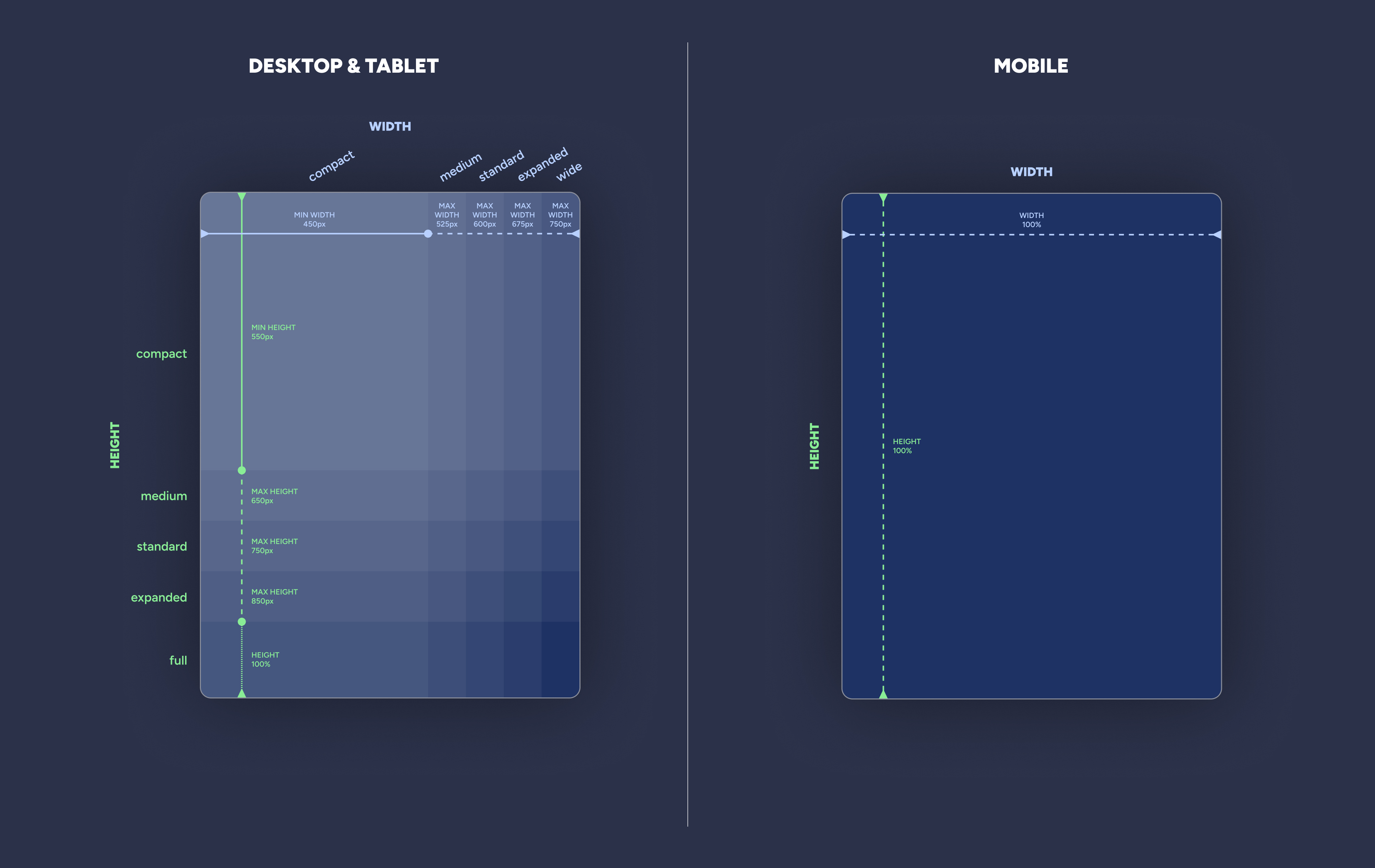
Note: The plugin separately uses a full screen sizing for mobile devices. Invalid frameWidth / frameHeight values fall back to "standard".
Updated about 2 months ago
Did this page help you?